The 15 worst corporate logo fails
By Richard Feloni, December 2015
![]()
And when it's bad, it can scare people away for good.
We've gathered some of the worst logo fails of all time. These unintentionally (or sometimes intentionally) reminded consumers of sex acts, lewd behavior, and other things that make 13-year-olds hysterical.
Many were pulled, and all will go down in internet infamy.
This is an update of previously published article by Aaron Taube and Laura Stampler.
The English press had some fun with the London 2012 Summer Olympics logo, saying it resembled both Lisa Simpson performing a sex act and a "punk" swastika. The Iranian government even claimed the stylized "2012" spelled out "Zion" and entertained boycotting the event in protest. The logo ended up looking better in action in its various stylings, but the damage was done.
![]()
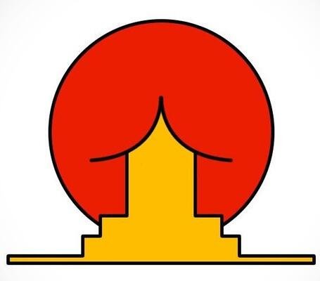
Brazil's Federal University of Santa Catarina's Institute of Oriental Studies was going for a Japanese temple against the Japanese rising sun. As soon as someone saw the uh, roof, in a butt, the logo achieved meme status in 2005 and the school took it down.
Kostelecké uzeniny is a popular Czech sausage company that has been around since 1917. It's easy to see why non-Czechs find the logo so amusing, but it's been on all the company's products since the '20s.
![]()
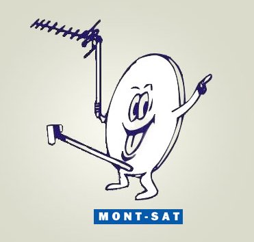
Mont-Sat is a Polish company whose technicians are more than happy to install a satellite in your home or business. It’s never changed its peppy logo.
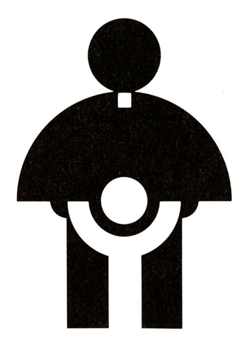
The AIGA association of design has archived the 1974 Catholic Church's Archdiocesan Youth Commission logo as an example of great design. Subsequent scandals have turned the logo around and made it seem quite dark indeed ...
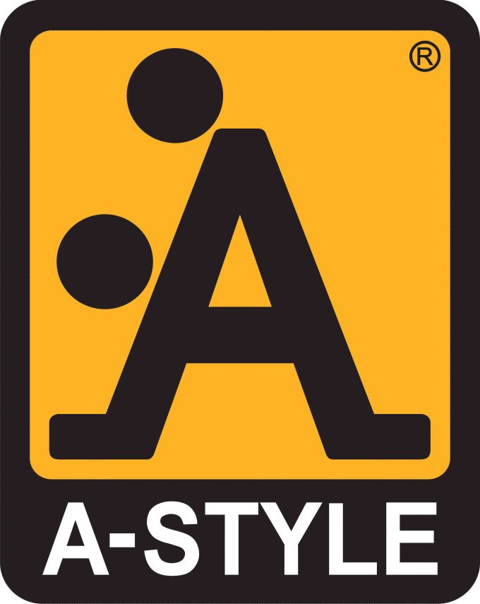
In 1991, the Italian clothing company A-Style created a stylized "A" that intentionally looks like two people having sex to create provocative buzz. More than 20 years later, many people still don't realize the company's in on the joke.
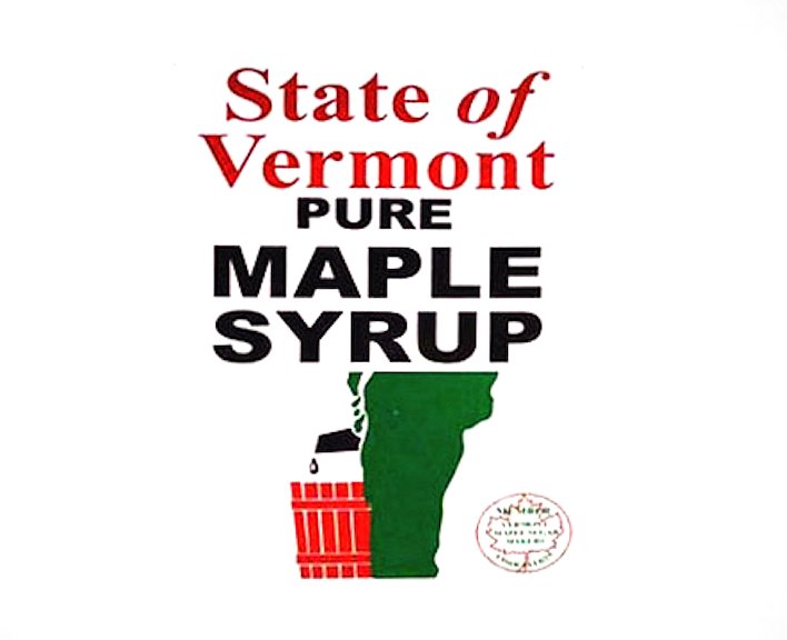
The State of Vermont specially brands all of its pure maple syrup, which is some of the best in the world. But in this long-standing logo, the state looks more like a guy than a maple tree.
The Japanese company Kudawara Pharmacy once decided to play with the English alphabet for its logo, but the dots turned a decent design into a raunchy one real quick. The company is no longer in business, at least under this name.

The Arlington Pediatric Center in Virginia is a great organization for low-income families, but anyone who saw this old logo may have had second thoughts. It made it onto the organization's doors and awning before the company decided to pull it.

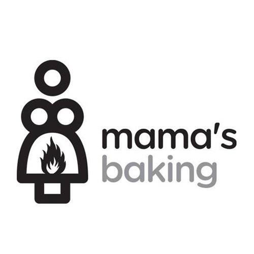
Mama's Baking is a small bakery in Greece that has a logo with an Oedipus complex, and it has kept its logo even after it became widely mocked online.
An old photo of the Kid's Exchange consignment shop in Georgia proves the importance of proper punctuation and spacing in a logo — this one is now long gone.

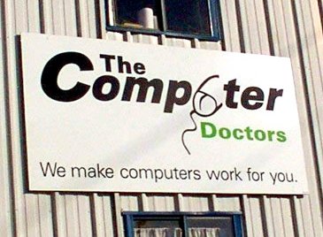
The Computer Doctors was a small business that could have avoided internet infamy with a better graphic-design budget.
Once you see a woman's naked torso in this old flyer for some local Junior Jazz Dance Classes, you won't be able to un-see it.

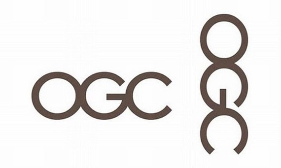
When the British Office of Government Commerce unveiled its sleek logo redesign in 2008, the English press flipped it 90 degrees to show it as a man "enjoying" himself, forcing the embarrassed OGC to scrap the design.
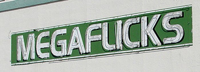
The sign for the late MegaFlicks video-rental store in a Florida mini mall was passed around by designers online as a perfect example of why kerning, the spacing between letters, is so important. It stayed up until the streaming era killed video stores several years ago and a bank took over the location.